Dungeon Knight
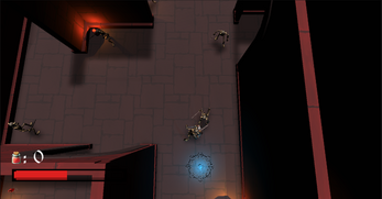
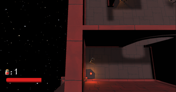
The minions of an ancient evil seek to free the Skeleton Lord that is in deep slumber. You have been tasked to fight through hordes of enemies and make your way through the dungeon. The world's fate rests on your shoulder's now. Become the Dungeon Knight!
Attributions:
Free Casual Game SFX Pack - Tim Beek: https://assetstore.unity.com/packages/audio/sound-fx/free-casual-soundfx-pack-16...
GolemMonster - Siuniaev: https://assetstore.unity.com/packages/3d/characters/creatures/golemmonster-33260
Potions, Coin, And Box of Pandora Pack - Alexander Kotov: https://assetstore.unity.com/packages/3d/props/potions-coin-and-box-of-pandora-p...
Blue Dungeon - PolySoft3D: https://assetstore.unity.com/packages/3d/environments/dungeons/blue-dungeon-1069...
Fantasy RPG Cursor Pack - ToxicDelta: https://assetstore.unity.com/packages/2d/gui/icons/fantasy-rpg-cursor-pack-87154
Real Stars Skybox Lite - Geoff Dallimore: https://assetstore.unity.com/packages/3d/environments/sci-fi/real-stars-skybox-l...
Medieval Cartoon Warriors - Jose (Dogzerx) Díaz: https://assetstore.unity.com/packages/3d/characters/medieval-cartoon-warriors-90...
Dungeon Skeletons Demo - Polygon Blacksmith: https://assetstore.unity.com/packages/3d/characters/creatures/dungeon-skeletons-...
Toon RTS Units - Demo - Polygon Blacksmith: https://assetstore.unity.com/packages/3d/characters/toon-rts-units-demo-69687
Music:
Enchanted by Keys of Moon | https://soundcloud.com/keysofmoon Music promoted by https://www.chosic.com/free-music/all/ Creative Commons CC BY 4.0 https://creativecommons.org/licenses/by/4.0/
Download
Development log
- PostmortemApr 08, 2022
- Game DevelopmentApr 08, 2022


Comments
Log in with itch.io to leave a comment.
I thought this game was really well made. The UI change from the beta to the final build in terms of text placement was much better. The point and click combat felt smooth and the level with the unkillable enemy was a neat idea that was implemented well with the navmesh. It did not feel like it was neither too fast or too slow.
You guys did a great job with the atmosphere of this game it was really visually pleasing to look at. Additionally, the movement felt really smooth and responsive. Some improvements could be to possibly add a few more animations for combat and maybe expand on the current system.
I am impressed!!! This game was really well done and it is evident that a lot of time and effort was put into this. Besides the UI for the text being a little too small in some instances I thought the game was great.
I liked the world of warcraft esque theme. I also thought the music choices were good. However, the UI on the web version is quite small. Overall, I loved the games and its graphics!
This game is very well developed and detailed. The little things like the sound effects, the customized cursor, and the dialogue boxes make this game come to life. The gameplay is also very well done. This game reminds me of Wizard101 which used to be my favorite game for a while
This game is incredibly well done! The theme is really cool and everything ties in together from the music, to the sound effects, to the background, assets and lighting used. It was really fun to play and I really like how the player gets teleported onto the next level!
The game looks so completed and I was really impressed by the conversation with the NPC. It reminds some old RPG games I played. Also, I like the different design for each level!! Great game!!! I am really looking forward for updates and new levels!
I was really impressed by this game because I felt like it contained all elements I’d expect from any new indie games I’d try out on my switch. The fact that you all had NPCs to talk to and the adventurous aspect of it, made it feel like you all tried to immerse the player into this virtual world. I think that was one of the things that hit me the most, the immersion that this game gives. I love how an actual character in the game builds up the world and the storyline instead of just listening to a simple monologue at the beginning. Those are the kind of things that I feel makes a game feel like an actual …game! Haha
I was really impressed when I saw this game during beta testing. The overall concept of the game was very well planned and designed. What I was the most pleasantly surprised about was the implementation of a NPC to help guide the player. I reminded me of older games that I've played on the web in the past.
I remembered one old game that is very similar to this one that is extremely popular about 10 years ago. That's to say, the game has very interesting background and the layout of the game looks very good. I like the chasing part at the end of the game most because it prevents the players from getting bored.
Some suggestions I would say is that the enemy is too easy to defeat because once you left clicked the enemy, the enemy will be instantly died. I would suggest add some enemies that have higher health bar or have enemies that are shooting arrows toward the player. Also, for the final chasing part, the speed of the boss is too slow, making it easy for the player to escape. I would suggest either improve the speed or to make the map larger and more complex.
Wow. This looks amazing. I love the player model, the floor design, the music, and the teleportation. This game is very beautiful. One thing I would recommend is to make the text larger.
This game is incredibly well done and thought out! I loved the conversation bubbles at the beginning and the sounds really brought the theme together. I think the title and end screens (happy) could be matched better to fit the overall game (dark and mysterious) but other than that, incredible job!
I really appreciate the detail and polish that is putt into this game. The character models for the enemies and player fit the dungeon theme and also the level designs for each level smooths the player into the increase difficulty. Overall the visuals and gameplay are solid and very polished but I do wish that the UI for the potions and health be a bit bigger.
I like the text bubble you guys designed. I like the top-down camera, the right click for moving is just like league of legends. The storyline is attracting and all the assets used match well with the game's theme.
This game was so impressive! Not only was the game design itself super developed but the storyline was well thought out as well, making for a great experience for the player. The enemies were the right level of difficulty, not making it impossible to beat, which I know my team had trouble achieving. I don't have much critical feedback besides reiterating feedback from class where the theme of the start/end scenes did not match the theme of the game itself.
The game is absolutely stunning! Visually it looks so complete that I cannot tell it apart from indie games on the market. The chat boxes are a great touch for teaching the player through each level and what to do. I love the robust world built and the smallest thing like the swinging lantern and the shadow made me immerse into the world you are building.
This game was very polished and super cool. I love the fact that you guys had NPCs and also a tutorial. The unkillable beast was a very nice touch. I did feel that the difficulty was a little vast between levels, however I think that that just leave a lot of room to add more levels! This game is excellent and you should all be very proud of yourselves for a job well done. The type writer effect was a nice touch.
This game was absolutely mind-blowing you guys crushed it. Starting from your guys assets to the story line, this game was really well polished. I love how the game felt while playing and the dialogue additions between you and the NPC. Also the portal featuring to both teleport you and summon the boss was absolutely insane to see. Good work!
The visuals for this game were very developed with the menu background images, font, text boxes, characters, and map overall. I like the NPCs at the beginning who teach you how to play the game. I also think the background music and the choice of a space-like background for the dungeons are very fitting with the theme of the game. One minor suggestion I have would be to make the UI a little bigger, but, overall, it is a very well-made game.
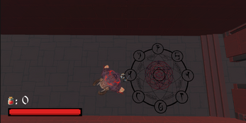
I think everything about the game is really cool. I love the little intricacies like the moving lamp that creates a moving shadow or even the summoning circles that genuinely look like something is being summoned. I also think you dialog flows really well. Overall, the game feels very good and I can see the hard work put in.
Honestly a well done and professional game in terms of style, functionality, UI! It was fun to explore the map. The assets in this game is what captured my attention because it is so well done.I really like how everything works together cohesively and brings out the best player experience in terms of the dialogue, movement, aesthetics.
Seriously so, so cool. Looks like something I would see on steam or on an ad somewhere! I love the coherent theme and feel, and I think the UI/assets/dialogue all suit each other really well. This game feels so fleshed out and fun to play, and I think the text really helps submerge the player into the game.
From my first impression, this game looks so mature and like can be published already. The model and the UI, especially the NPC's dialogue window, fit so well and really absorb me inside the game. I think the skybox is actually a punchline that not only fills in the gaps in the background but also emphasizes the magical and mysterious element. Besides, I'm impressed that the monsters' steps fit so well as their speed which makes their movement real and lets the player feel intense. My suggestion would be, to add more stages, fill the storyline, and this game can be a masterpiece.
I really like how coherent all the assets are to create the environment, they work really well with the music and gameplay to give the game a polished feel. I think I'd be cool if the music shifted out of the calmer theme earlier once you got to the 2nd combat-oriented level, but that's pretty trivial.
I love the background and the music it fits to the theme really well. The player movement and different animations make the game look more realistic. Love the idea very fun to play!!
the game is very well developed and has a lot of improvements from the beta version! I really like the lighting effects in the game as well as the conversation system. The idle animation also made the entire game more realistic. I think some future revisions can be adding a health bar for the enemies as well to add a bit more difficulties to the game. Great job!